Enterprise Content Creators Will Love These Updates in WordPress 5.7

Good news for WordPress VIP content creators: WordPress 5.7 has unpacked a veritable bounty of feature enhancements to the Gutenberg block editor, including further steps towards FSE (full site editing).
Here’s our at-a-glance summary of 12 exciting Gutenberg features and enhancements included in WordPress 5.7. These new capabilities streamline four of the most common tasks for digital marketers: customizing buttons, editing images, sharing on social, and creating page layouts.
Let’s dive in.
Customizing buttons
Every marketer knows the importance of a clear, enticing call to action. With WordPress 5.7, more power is in your hands to make your buttons look exactly how you want them. Gutenberg now allows you to adjust the size of buttons by defining the percentage widths for button blocks. Got multiple buttons you’re trying to wrangle? You’ll enjoy the added ability to stack buttons vertically—and transform them from a vertical to a horizontal orientation with a single click.
Editing images
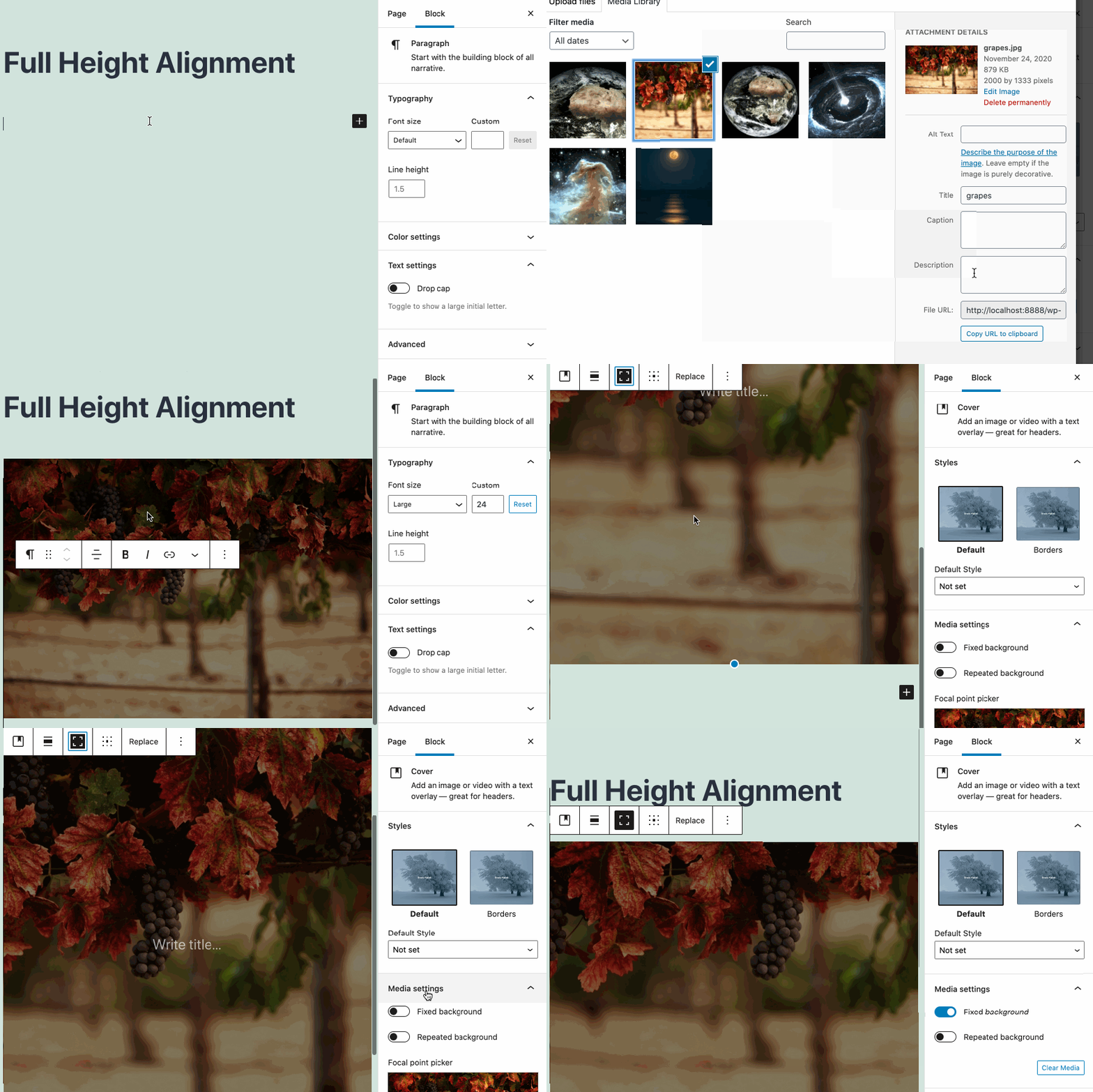
Get perfectly aligned cover images in seconds with the new full height alignment option. There’s also a clever way to identify whether it’s possible to overlay text in an image block. Click, ‘Add text overlay’ to transform an image into a cover image, and watch as a placeholder paragraph appears.

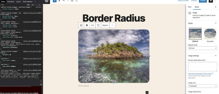
In WordPress 5.7, you can also define the border radius of an image block to create graphics with rounded corners.

Enhanced social sharing
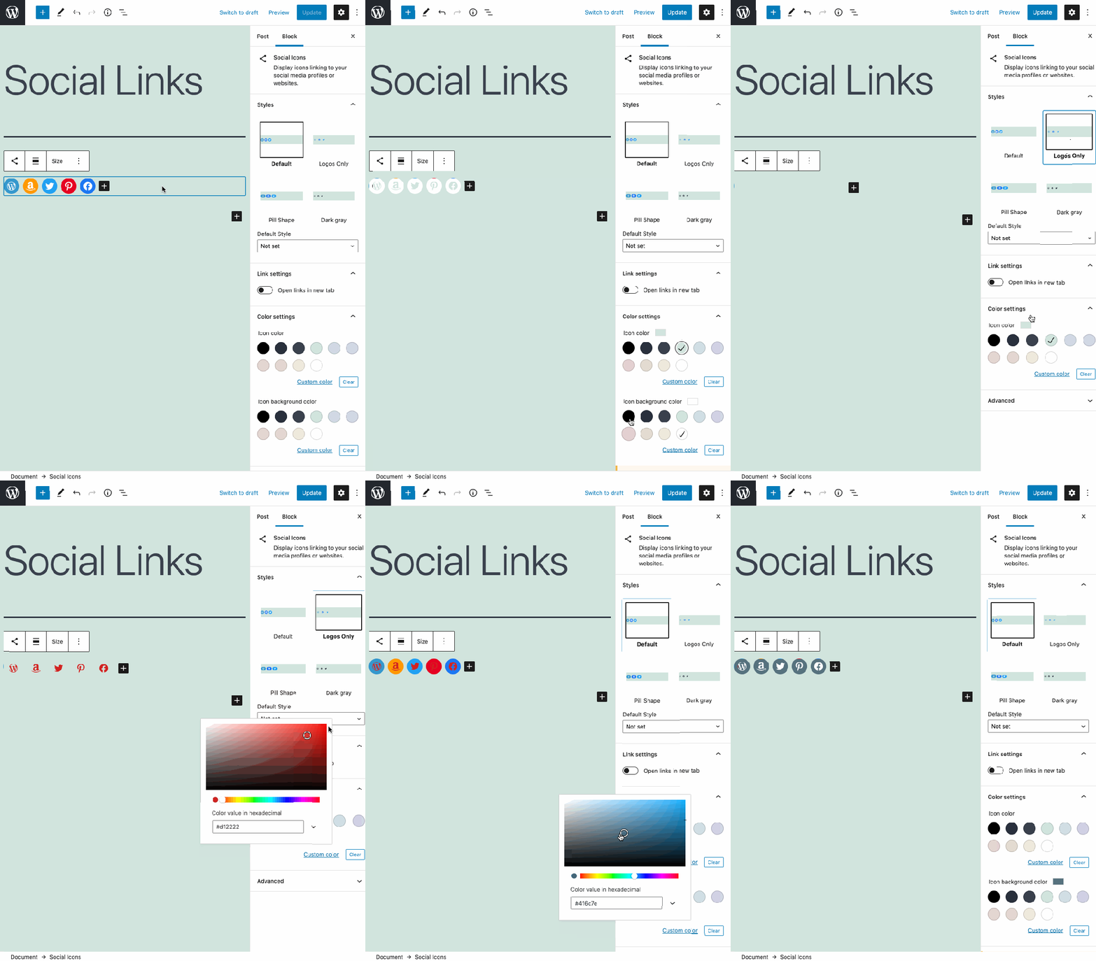
Hayley Nelson, the VP of Content Marketing at Salesforce, gauges the impact of content in only five words: “Is it worth a re-share?” The latest edition of Gutenberg equips you with more tools to encourage your audience to hit that share button. In just a few clicks, you can edit the size of your social icons, customize the icon images, or update the colors to align with your brand.

Building layouts with reusable blocks
WordPress 5.7 provides an important change to how reusable blocks are shown and edited. Specifically, these updates solve some previous issues around block inspector and block toolbars.
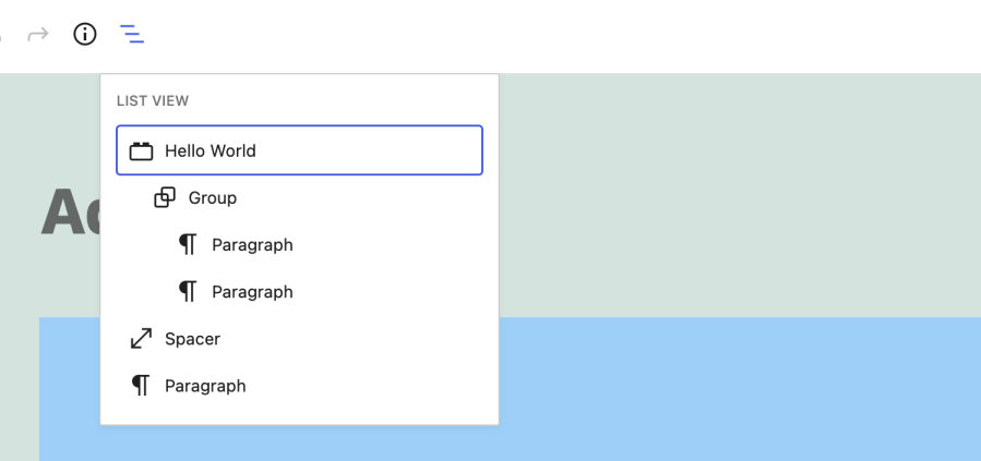
For example, the name of a reusable block is now shown both in the interface and as a label to the block itself.

Curious how a block would look if you transformed it to something else—a column view instead of a group, for example? Make an informed decision with the new transform preview tool. It enables you to hover over a block type in the editor to get a quick look at how the new configuration would look, without committing to any changes.
There’s also a new border around the parent group of a reusable block. This outline makes it easier to see how the individual components of reusable blocks are grouped together. Need to add another block to your layout? Now you can drag and drop blocks and block patterns directly into your page from the inserter—so it’s more intuitive (and more efficient) to build pages with customized layouts.
The takeaway
The Gutenberg block editor already helps WordPress VIP customers ship content 60% faster. And we’re delighted to see its capabilities improving with every WordPress software update.
For a full list of the latest Gutenberg features and performance improvements, check out the WordPress 5.7 release announcement. Finally, learn more about using the Gutenberg block editor to accelerate content production in our webinar, Gutenberg for Enterprises.